|
Got a thin skin? Then look elsewhere. Post a link to an image that you've made, and invite others to offer their critiques. Honesty is encouraged, but please be positive in your constructive criticism. Flaming and just plain nastiness will not be tolerated. Please note that this is not an area for you to showcase your images, nor is this a place for you to show-off where you have been. This is an area for you to post images so that you may share with us a technique that you have mastered, or are trying to master. Typically, no more than about four images should be posted in any one post or thread, and the maximum size of any side of any image should not exceed 950 px.
Moderators: Greg B, Nnnnsic, Geoff, Glen, gstark, Moderators
Forum rules
Please note that image critiquing is a matter of give and take: if you post images for critique, and you then expect to receive criticism, then it is also reasonable, fair and appropriate that, in return, you post your critique of the images of other members here as a matter of courtesy. So please do offer your critique of the images of others; your opinion is important, and will help everyone here enjoy their visit to far greater extent.
Also please note that, unless you state something to the contrary, other members might attempt to repost your image with their own post processing applied. We see this as an acceptable form of critique, but should you prefer that others not modify your work, this is perfectly ok, and you should state this, either within your post, or within your signature.
Images posted here should conform with the general forum guidelines. Image sizes should not exceed 950 pixels along the largest side (height or width) and typically no more than four images per post or thread.
Please also ensure that you have a meaningful location included in your profile. Please refer to the FAQ for details of what "meaningful" is.
 by Geoff on Mon Sep 17, 2007 1:08 pm by Geoff on Mon Sep 17, 2007 1:08 pm
Having been quite busy with more family portrait shoots I haven't been around as much as I'd like to on the forum.
Here's one from a shoot last week. Taken with the non woven (portable) canvas backdrop on the stands, and the Oz Plaza 110 light with brolly, triggered from the SB800. This was PP'd on my (calibrated) CRT monitor, when I displayed it on the other LG LCD, the whites looked (not blown) but too bright. Taken with the 17-55dx.
Comments welcomed:

Taken against a painted wall in their house, small amount of PP sharpening applied and curves adjustment.

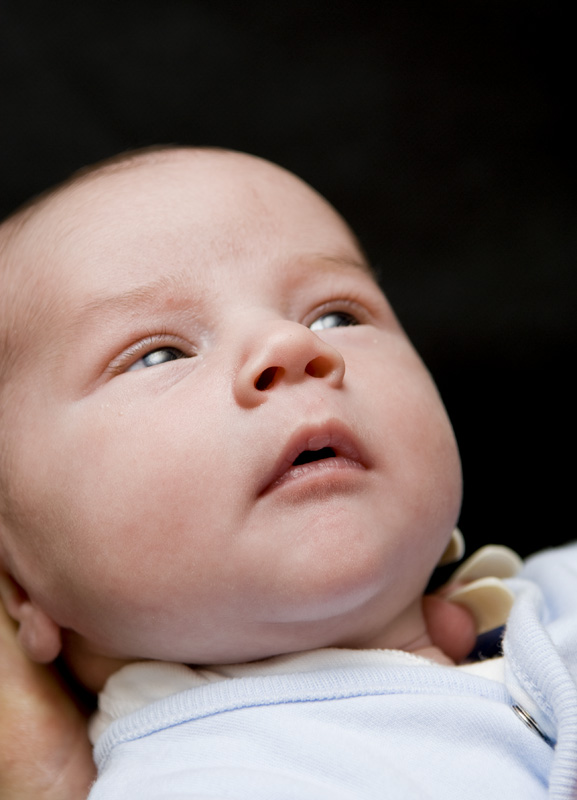
In Mum's hands:
-

Geoff
- Moderator
-
- Posts: 7791
- Joined: Sat Aug 07, 2004 12:08 am
- Location: Freshwater - Northern Beaches, Sydney.
-
by MHD on Mon Sep 17, 2007 1:50 pm
Wow! those first two are topclass!
-

MHD
- Moderator
-
- Posts: 5829
- Joined: Sat Sep 11, 2004 8:51 pm
- Location: Chicago Burbs
-
by Reschsmooth on Mon Sep 17, 2007 2:04 pm
Geoff, you are really getting some great results with the lights (and your skills, of course  )
The second is great - Mischievously innocent.
My only criticism with the first is the dad's pose - leaning forward without a shirt is not always flattering, if you know what I mean. Also, his shoulders seem brighter than his face - it looks like you have one of the lights above you pointing down? If so, if you had dad leaning back a bit more, you would get a bit more light on his face and also solve the issue I mentioned above (leadning forward). This is just my opinion, of course, based on a lot of inexperience Regards, Patrick
Two or three lights, any lens on a light-tight box are sufficient for the realisation of the most convincing image. Man Ray 1935.
Our mug is smug
-

Reschsmooth
- Senior Member
-
- Posts: 4164
- Joined: Tue Aug 01, 2006 2:16 pm
- Location: Just next to S'nives.
-
by Glen on Mon Sep 17, 2007 2:11 pm
Nice work Geoff! I like them all. I wonder if it would have been possible to light Dad's face more than his body? Dad obviously walks around in the sun but with his shirt on, his face is quite a bit darker than his body, so a difficult subject. To me, due to the lightness, I find his right arm very prominent. Maybe roll him in the dirt first?  http://wolfeyes.com.au Tactical Torches - Tactical Flashlights Police torch rechargeable torch military torch police military HID surefire flashlight LED torch tactical torch rechargeable wolf eyes flashlight surefire torch wolf eyes tactical torchpolice torchThank You
-

Glen
- Moderator
-
- Posts: 11819
- Joined: Sat Aug 07, 2004 3:14 pm
- Location: Sydney - Neutral Bay - Nikon
-
by sirhc55 on Mon Sep 17, 2007 2:19 pm
Geoff:
#1 - I agree with Patrick in that the pose is awkward - a crop up to just above the foot may help the balance. The shoulder is blown - it is showing 255 through the RGB spectrum.
#2 - A lovely shot but the whiteness of the dress detracts from the little girls face. A reflector in the little girls hands might have improved the lighting to her face.
#3 - I may be wrong here but this pic appears OOF. The blue edging to the babies top appears in focus but the face is not.
Chris
--------------------------------
I started my life with nothing and I’ve still got most of it left
-

sirhc55
- Key Member
-
- Posts: 12930
- Joined: Fri Sep 17, 2004 6:57 pm
- Location: Port Macquarie - Olympus EM-10
by fishafotos on Mon Sep 17, 2007 2:51 pm
Those first two are absolute rippers! The only thing that annoys me is the 'glazed' look of her eyes in the last one. I'm not sure if it's DOF or light reflections.
Nikon D80, MB-D80, Nikon 50mm f/1.8, Nikon 17-55mm f/2.8, SB-800, Sigma 18-200 f/3.5-6.3
Various bits of borrowed/stolen glass/speedlights etc. - zero style or taste.
http://harryfisherphotos.smugmug.com
-

fishafotos
- Member
-
- Posts: 271
- Joined: Mon Oct 16, 2006 12:48 am
- Location: East Fremantle, W.A - D80
-
by Geoff on Mon Sep 17, 2007 11:57 pm
Thanks for the comments guys, much appreciated.
If I had more time with this shoot I would have experimented a little more with the lights, but the little girl was well, a typical 20month old, happy and sad within moments of each other. I didn't have an assistant on this shoot, so I was attempting to make her smile, get the lighting right and ensuring Dad was also looking at the camera...hard to juggle! However, that said there's been some great constructive criticism here and I may try some PP to enhance the shots a little more.
I'm really enjoying the photography side of things in my life and I feel soo lucky to be doing two things I adore  Life's good!
-
Geoff
- Moderator
-
- Posts: 7791
- Joined: Sat Aug 07, 2004 12:08 am
- Location: Freshwater - Northern Beaches, Sydney.
-
by chrisk on Tue Sep 18, 2007 2:43 pm
#1: very nice shot. i think dad's runners look a little out of place though. with no shirt i think bare foot would work better and suit the mood. perhaps even just a singlet to be...ahhh...more flattering...so to speak. 
#2: stunning. i wouldn't change a thing. she is sooooooo gorgeous !!
#3: not sure why i don;t like this. maybe the crop ?? the angle ? i dunno. then again, i'm not a fan of newborns....not even mine. lol Last edited by chrisk on Tue Sep 18, 2007 3:56 pm, edited 1 time in total.
EM1 l 7.5 l 12-40 l 14 l 17 l 25 l 45 l 60 l 75 l AW1 l V3
-

chrisk
- Senior Member
-
- Posts: 3317
- Joined: Fri Mar 09, 2007 8:50 pm
- Location: Oyster Bay, Sydney
-
by Bindii on Tue Sep 18, 2007 2:48 pm
I lurve that first shot... but am betting that Dad will be a bit too aware of extra kilo's creeping up and stuff.. yeah we humans are a vain lot aren't we... *sigh*
The second is also great..but lacks a little detail around her eyes... and I kinda likes the baby one too.. they are sooo hard to get a good angle on for photography at that age aren't they!.. The last thing I want to do is hurt you... but it's still on the list...
-

Bindii
- Senior Member
-
- Posts: 1895
- Joined: Mon Sep 18, 2006 2:28 pm
- Location: Ormeau Hills Queensland
Return to Image Reviews and Critiques
|
