A discussion forum - and more - for users of Digital Single Lens Reflex cameras.
landscape attempt(s)Moderators: Greg B, Nnnnsic, Geoff, Glen, gstark, Moderators
Forum rules
Please note that image critiquing is a matter of give and take: if you post images for critique, and you then expect to receive criticism, then it is also reasonable, fair and appropriate that, in return, you post your critique of the images of other members here as a matter of courtesy. So please do offer your critique of the images of others; your opinion is important, and will help everyone here enjoy their visit to far greater extent. Also please note that, unless you state something to the contrary, other members might attempt to repost your image with their own post processing applied. We see this as an acceptable form of critique, but should you prefer that others not modify your work, this is perfectly ok, and you should state this, either within your post, or within your signature. Images posted here should conform with the general forum guidelines. Image sizes should not exceed 950 pixels along the largest side (height or width) and typically no more than four images per post or thread. Please also ensure that you have a meaningful location included in your profile. Please refer to the FAQ for details of what "meaningful" is.
Previous topic • Next topic
9 posts
• Page 1 of 1
landscape attempt(s)
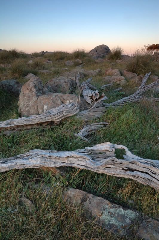
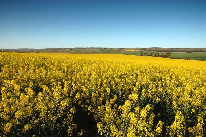
hey everyone, i recently hurt my shoulder and as a consequence ive had some free time to go do some shooting. So seeing the weather was good today i headed to the hills to try some landscape shots. any feedback would be greatly appreciated. Oh and if the canola shot looks familar i reshot the spot today as the weather was a whole lot better for it!
nikon d300, 10.5mm f2.8, 17-50mm f2.8, 50-150mm f2.8. Bronica sq-a 80mm f2.8,. sunpak 383's and a 622 for kicks, pw's, and other assorted bag fillers
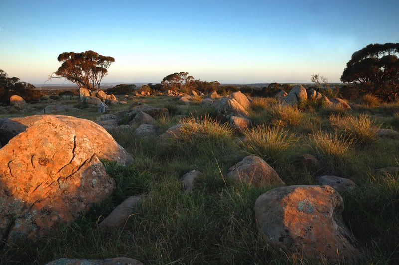
I love 2 and 3. The mix of textures and shapes in the second it excellent and there's a lot of depth to the shot..
I think #4 is the winner here. Lovin' those colours..
Nikon D70
12-24 DX, 18-70 DX, 70-200 VR 20" iMac Intel C2D Aperture 2.1 PS CS3 http://www.jamesrobertphotography.com
Just to be different, #1 stands out to me. Ij just want to walk into the picture.
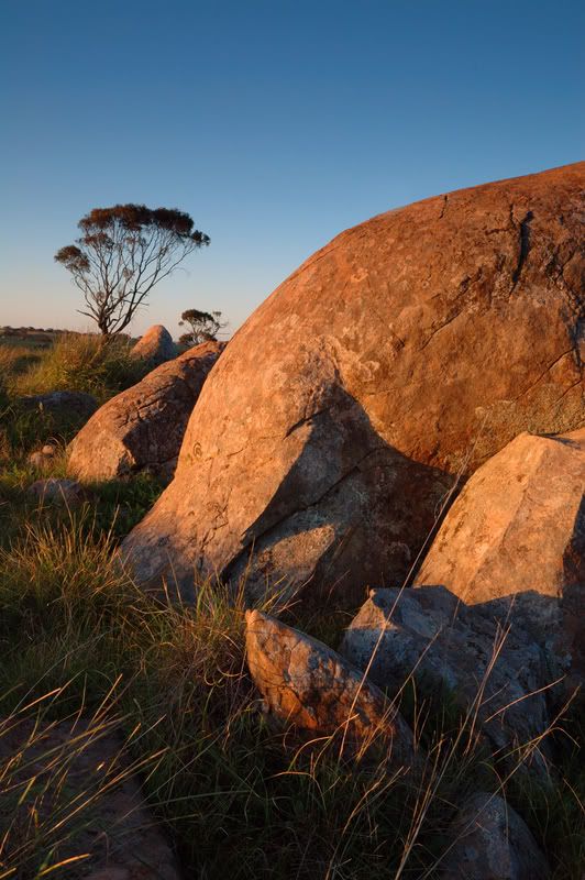
#3 is a close second. Greg
It's easy to be good... when there is nothing else to do
Nice group of shots here.
Number 3 is my choice. Fantastic colors and framing. Suitable for framing! I felt the framing of number 2 was off a little, the trees on either side of the frame are both cut off. Nice textures and interesting composition on number 1. Number four: nice colors, good solid composition. good work!
Beautiful tone, texture and colours. The beautiful light has served you well.
The golden light falling on the scene in #2 together with the framing has created a very pleasing image. I think the horizon needs slight adjustment in #3. Th tree in the background seems a little tilted. Last the canola fields, beautiful colours and scene. Don't know if you used a tripod or wind was a factor but a little sharpness needed in the foreground canola. Perhaps even cropping a little off the bottom to remove some of that negative space that doesn't really enhance the image at all. Hope that makes sense cheers marco
thanks for the reponses everyone. i hadnt notice the horizon was wonky so my Sony!!! i also hear you on the negative space. all taken under advisement!
nikon d300, 10.5mm f2.8, 17-50mm f2.8, 50-150mm f2.8. Bronica sq-a 80mm f2.8,. sunpak 383's and a 622 for kicks, pw's, and other assorted bag fillers
Nice work! You have an eye for landscapes and know how to play colours against each other. Pix 1,2 and 4 work beautifully for me. Pic 3 is weak in the composition as the curve of the rock in the foreground leads the eye out of the image space. This diminishes the tree in the background which almost appears as a seperate image.
Regards
Matt. K
Previous topic • Next topic
9 posts
• Page 1 of 1
|


