|
Got a thin skin? Then look elsewhere. Post a link to an image that you've made, and invite others to offer their critiques. Honesty is encouraged, but please be positive in your constructive criticism. Flaming and just plain nastiness will not be tolerated. Please note that this is not an area for you to showcase your images, nor is this a place for you to show-off where you have been. This is an area for you to post images so that you may share with us a technique that you have mastered, or are trying to master. Typically, no more than about four images should be posted in any one post or thread, and the maximum size of any side of any image should not exceed 950 px.
Moderators: Greg B, Nnnnsic, Geoff, Glen, gstark, Moderators
Forum rules
Please note that image critiquing is a matter of give and take: if you post images for critique, and you then expect to receive criticism, then it is also reasonable, fair and appropriate that, in return, you post your critique of the images of other members here as a matter of courtesy. So please do offer your critique of the images of others; your opinion is important, and will help everyone here enjoy their visit to far greater extent.
Also please note that, unless you state something to the contrary, other members might attempt to repost your image with their own post processing applied. We see this as an acceptable form of critique, but should you prefer that others not modify your work, this is perfectly ok, and you should state this, either within your post, or within your signature.
Images posted here should conform with the general forum guidelines. Image sizes should not exceed 950 pixels along the largest side (height or width) and typically no more than four images per post or thread.
Please also ensure that you have a meaningful location included in your profile. Please refer to the FAQ for details of what "meaningful" is.
 by wendellt on Sun Jan 28, 2007 9:58 pm by wendellt on Sun Jan 28, 2007 9:58 pm
for your first try your doing well
i bet your most happy with the last one
I can tell, it's really good because it has that fringe of hair blows up a little
movement is always good
the white balance however on the last 2 is warm but suits the image
regarding your lighting i can see you used 2 lights on either side on the first one, good work getting rid of all those shadows
take note next time on your white balance
-

wendellt
- Outstanding Member of the year (Don't try this at home.)
-
- Posts: 4078
- Joined: Sun Feb 20, 2005 10:04 am
- Location: Dilettante Outside the City Walls, Sydney
-
by Onyx on Sun Jan 28, 2007 9:59 pm
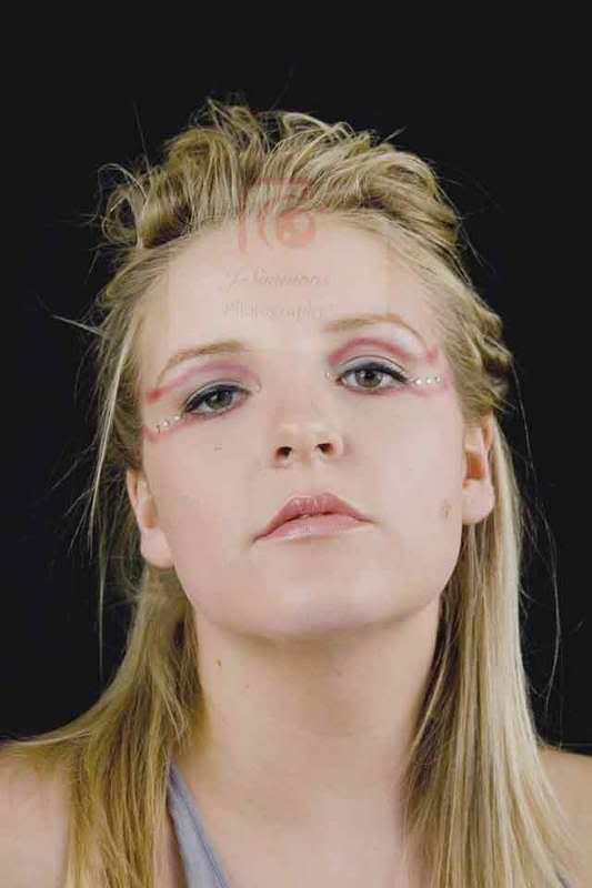
Nice lighting setup and backdrop. I can't fault anything except your choices in preservation of copyright. A bit too drastic IMO, but if you felt the need; each to their own.
-

Onyx
- Senior Member
-
- Posts: 3631
- Joined: Sat Aug 07, 2004 6:51 pm
- Location: westsyd.nsw.au
-
by Alex on Sun Jan 28, 2007 10:15 pm
Nice work. I find the watermark quite annoying though...
Like fist and last.
Alex
-

Alex
- Senior Member
-
- Posts: 3465
- Joined: Thu Feb 24, 2005 6:14 pm
- Location: Melbourne - Nikon
-
by Oz_Beachside on Sun Jan 28, 2007 10:47 pm
You have some great results for a first, and for being one month into SLR, they look great!!!
Last one is my pic, but the reason is not your direct influence.
You have a black background, and black clothes. The two blend together, and then you lose the outline of the model (which is sometimes something you want, useful trick when you need to hide attributes), or fade out. Not necessary in this case. You can see what I mean uf you compare the seperation in the grey shorts, to the black dress and blouse in the earlier shots.
This could be overcome in a number of ways. Different color/shade clothes, different color background, use flesh to provide the seperation (such as hands on hips, or use of arms), highlighting the side of the subject, or backlighting the backdrop (hard to do with black). Each of these are a lesson in themselves, just sharing with you what I have been learning in the last few months. I too went to spotlight, and bought the $3/m fabric, and am using it in my next shoot (shoots to date have been on white backgrounds, which provide easy seperation).
Movement, eyecontact, and pose is great in the last one.
Watermarks kind of distracting when critiquing, maybe you could take them off the subject, place to side, in this audience (but thats your call).
The second shot the subject has nice shiny hair, and you have captured that well through accurate exposure and light placement no doubt.
Very impressed. I'm sure you found it quite a handful working with so many people in one day too, very admirable!
cheers and regards,
Oz
-

Oz_Beachside
- Senior Member
-
- Posts: 2227
- Joined: Thu May 25, 2006 11:31 pm
- Location: Black Rock, Victoria. D200
by beetleboy on Mon Jan 29, 2007 8:51 am
Good work for your first time. I also can't stand the watermark and feel you've seriously over-compressed these files as well.
Keep practising tho, as Wendell will tell you; it's a tough gig to crack =]
-

beetleboy
- Senior Member
-
- Posts: 821
- Joined: Fri Sep 17, 2004 4:57 am
- Location: Highbury, Adelaide
-
by !~DeViNe~DaRkNeSs~! on Mon Jan 29, 2007 8:56 pm
Thanks Heaps fellas! im very happy with what i have created here! yes im sorry they are alittle too compressed and the watermark is a PITA!! i just posted them on a few other unrelated forums so i wanted total cover!! 
I thought about the background as soon as she pulled out her blacks skirt etc  i unfortunatly had no control over the outfits etc i did suggest a grey for the background with a dim light behind it in the middle to kind of blow out the centre but Paul wasnt convinced so maybe on my own workings i can play around with the BG
i used Nathan's sigma 500 DT flash and mi gawd am i in love! i got sum VERY good results without flash but that was mainly with his 50mm as my 18-55 is only a f4.5 so i just couldnt break that to get a brillant image compared to the 50mm....must buy items...speedlite...50mm lens!
In regards to the WB i had been struggling previosu to the shoot as the reflection off the polished wood floor was "browning" everything. after placing the large lounge rug over the floor and Nathan showing me the grey card way of WB'ing and that just made it all good my PP was alittle hastened so that has not helped
Thanks again guys, i am posting a few more pics in a min in a new post Canon EOS 40D
Canon EOS 400D
50mm 1.8 EF
-

!~DeViNe~DaRkNeSs~!
- Member
-
- Posts: 437
- Joined: Mon Dec 18, 2006 9:19 am
- Location: Essendon - MELBOURNE
by Oscar on Mon Jan 29, 2007 9:14 pm
Jeremy, I like the first and last shots but would have preferred to see the shots without the watermark - at least if you had put it in less crucial locations.
As it is it just makes it harder for us amatuers to critique and comment on the shots.
Nonetheless IMHO you are on the way to some great shots. Well done.
Keep working on the shots.
Cheers, Mick 
-

Oscar
- Senior Member
-
- Posts: 1305
- Joined: Fri May 05, 2006 11:15 am
- Location: Panania, Sydney
by mattyjacobs on Mon Jan 29, 2007 9:42 pm
on watermarking images, I was really impressed by a guy I saw on dpreview.com, who used to get really creative with his watermarks ... if you search dbase for a guy called 'schutze' or something like that, check out his watermarks ... really cool
-

mattyjacobs
- Member
-
- Posts: 282
- Joined: Wed Sep 06, 2006 2:54 pm
- Location: Epping, Sydney
by Nnnnsic on Mon Jan 29, 2007 10:02 pm
Like Oz_Beachside has said,
I think your blacks really need to be separated. Whether you do this through lightening the entire thing up or feathering with curves...
Also, I think that your colours are a bit too saturated in the tones of the flesh.
Interesting though.
-

Nnnnsic
- I'm a jazz singer... so I know what I'm doing
-
- Posts: 7770
- Joined: Sun Aug 08, 2004 12:29 am
- Location: Cubicle No. 42... somewhere in Bondi, NSW
-
Return to Image Reviews and Critiques
|