

A discussion forum - and more - for users of Digital Single Lens Reflex cameras.
My wedding...Moderators: Greg B, Nnnnsic, Geoff, Glen, gstark, Moderators
Forum rules
Please note that image critiquing is a matter of give and take: if you post images for critique, and you then expect to receive criticism, then it is also reasonable, fair and appropriate that, in return, you post your critique of the images of other members here as a matter of courtesy. So please do offer your critique of the images of others; your opinion is important, and will help everyone here enjoy their visit to far greater extent. Also please note that, unless you state something to the contrary, other members might attempt to repost your image with their own post processing applied. We see this as an acceptable form of critique, but should you prefer that others not modify your work, this is perfectly ok, and you should state this, either within your post, or within your signature. Images posted here should conform with the general forum guidelines. Image sizes should not exceed 950 pixels along the largest side (height or width) and typically no more than four images per post or thread. Please also ensure that you have a meaningful location included in your profile. Please refer to the FAQ for details of what "meaningful" is.
Previous topic • Next topic
23 posts
• Page 1 of 1
My wedding...
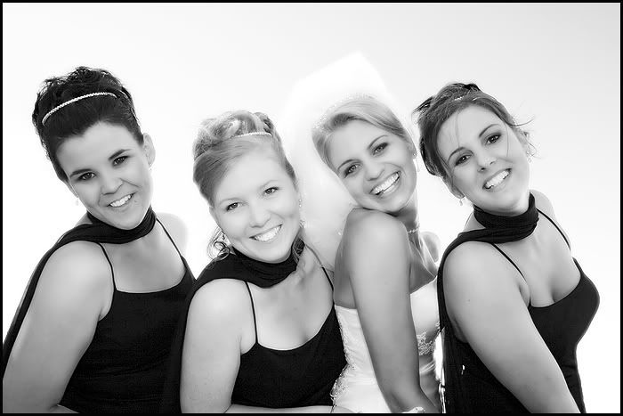
alright not mine...one I shot...from Saturday just gone...
Are you sure #1 didn't slip in from the buck's party? Wow! that's one for the album!
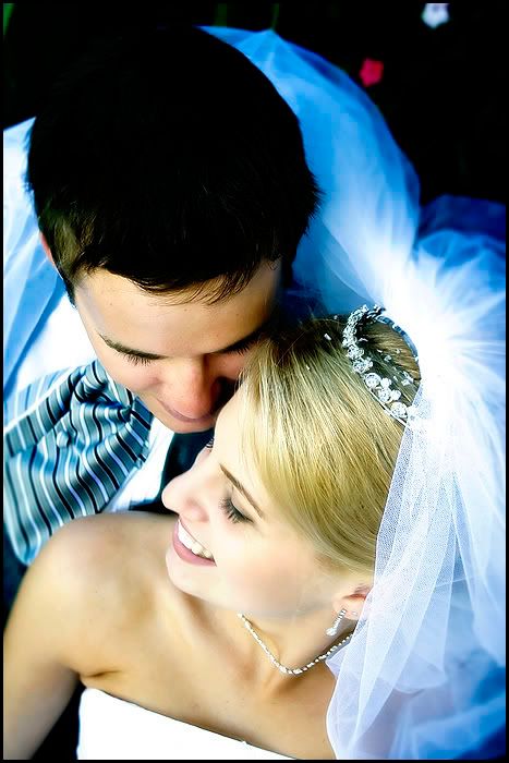
#2 is a very sweet photo pity 2nd from left is not looking at the camera! #3 is oversharpened so looks a bit rough. Try this in photoshop - select all (ctrl-a), copy (ctrl-c), paste-into (shift-Ctrl-v). This creates you a new layer. run a gaussian blur on the 2nd layer. Change the opacity until you like what you see. alternatively, change blend mode to overlay and play with the amount of gaussian blur #4 - I like it. Someone will comment on white balance, but I like the blue-black tone in this one. D3 | 18-200VR | 50:1.4 | 28:2.8 | 35-70 2.8 | 12-24 f4
picasaweb.google.com/JustinPhotoGallery "We don't know and we don't care"
the last one is priceless!!!! Did you get one from the same angle but them looking up?
Hassy, Leica, Nikon, iPhone
Come follow the rabbit hole...
#4 is great
I like them all though. They have this unique modern feel that is different from the usual wedding style. Abel
Nikon d80, an ever-changing collection of cheap glass, and 0 art-sense.
#1 is a bit too much Anna Nicole for me...and it looks like her teeth have been excessively whitened..I'm keeping my comments to above the cleavage..
#2 is just beautiful #4..OK I'll do the WB comment...brides skin and hair is a bit green..but I love the composition. The bride has a wonderful smile.. Great stuff
I love 'em all, but I would really like to see the WB cleaned up in #4.
g.
Gary Stark Nikon, Canon, Bronica .... stuff The people who want English to be the official language of the United States are uncomfortable with their leaders being fluent in it - US Pres. Bartlet
I love 2, 3 and 4 - I'm not a fan at all of #1, but that's a personal thing I guess. Nice work though .
Geoff
Special Moments Photography Nikon D700, 50mm 1.4, 85mm 1.4, 70-200 2.8VR, SB800 & some simple studio stuff.
Hi,
# 1 - nice PP but a little too clevagey for the album IMHO # 2 - well taken and again nice PP - my 2nd fav of the bunch # 3 - scares me. A bit too in ya face for my liking # 4 - Excellent!! Certainly my favourite. Composition, emotion great. I'm not a fan of the strong bules coming through but this would be a hard image to dislike either way. As Gary mentioned I would like to see some possible colour adjustment to this image. Very nice work. Cheers, Craig
Great pictures overall!
minor critisisms. #1- depending on the personality of the couple this could work in the album #2 - nice expressions but the bride is slightly overshadowed by the 2nd girl whose head looks bigger- maybe she is closer to camera #3 - Have you tried B&W for this one? grain may suit better #4 - GREAT SHOT! Did you use a stool? Is it a candid moment? Try removing the blue cast but it looks great eitherway...
Thanks for the c and c guys...
In answer to some of your questions....the lingerie shot was the brides idea...she is an outgoing type of girl and this shot shows her personailty...obviously it wouldn't work for some brides - actually it wouldnt work for most brides (in my opinion anyway) but she loves it and I guess thats all that matters..oh I have toned the mouth done as suggested and yes it looks better..thanks for the advise!!! I've done the third shot in mono and well...and it seems to work...but as I can only post four shots per thread I ended up choosing the colour to balance it out... The last shot wasn't a candid moment..its one that I set up for most of my weddings....a standard pose so to speak...and yes its taken from above..I generally carry a step ladder with me (yup, I'm short) but I didnt need it for this couple as there was park bench that I was able to sit them while I stood above them...I did play with the white balance on this shot..to remove the blue castings but I personally preferred te blue tonings...I guess its a matter of personal preferance...the couple have a choice of both shots so they can decide which they prefer...its strange isnt though how they sometimes choose the shots that we wouldn't...I guess we all have different tatses and I always try to supply a variety of styles of photography to suit different tastes... Thanks again guys...the time taken to critque is appreciated by me...after all how else do we improve..
#4 is a brilliant shot! I love it..
You are quite a talented photographer Bindii, Well DONE! Wish I could get you to take photos for my wedding in December D70s/D200; Tokina 16-50mm 2.8; 18-70DX ; 50mm 1.8 ; 80-200mm 2.8D ; SB600 + Stofen Omini Bouncer
I have a similar shot of no.1 in my wedding album - taken after an exhausting best day of my life!
I love #1 and #4 - well done Bindii - I too like the blue cast... Chris
D300 | D80 | 14-24 f/2.8 | 24-70 f/2.8 | 35 f/2 | 105VR f/2.8 | 18-200VR | SB600 | R1 | GP-1 |
Bindii,
Apart from the obvious charms of the first shot, I particularly like the way you've handled the lighting. Highlights and shadows all look great and I think you've done a top job in capturing this lady's cheeky personality and there are some lovely warm flesh tones coming through. She's going to be very proud of that shot in years to come. The second shot doesn't do a lot for me though - whether it's the mono treatment or, in my opinion, a relatively staid pose, the shot just doesn't reach out and grab me. The bride's lovely eyes and smile really come out in the third shot - I know you have to have some veil images but what a shame to cover up that face! Nice work though. The fourth - beautiful. I can see why you like the cool colour balance and I love the pose. Do you shoot one with them looking up to the camera as well? Simon
D300 l MB-D10 l D70 l SB-800 l 70-200 VR l TC 17-E l 18-70 f3.5-4.5 l 70-300 f4-5.6 l 50 f1.4 l 90 Macro f2.8 l 12-24 f4 http://www.redbubble.com/people/manta
Bindii, these are great - love your style.
Greg - - - - D200 etc
Talent hits a target no one else can hit; Genius hits a target no one else can see. - Arthur Schopenhauer
Well done Bindii, like them all, and most importantly they will be very happy with them.
Cheers
Impressive images Bindi. You are quickly developing your photographic skills and a style of your own. I like the last one and I think the blue tinged rim you have created suits the image in this case. Also enjoyed #1 high key and I think whilst not overly done in my opinion I would take Andrew's (padey) point of skin texture. Terrific set
cheers marco
If this is the first go Bindi well done. It will improve imensely from here on in. By the way these are great
Cheers jethro shoot it real.
look! and see. Shoot and feel
Previous topic • Next topic
23 posts
• Page 1 of 1
|


