|
Got a thin skin? Then look elsewhere. Post a link to an image that you've made, and invite others to offer their critiques. Honesty is encouraged, but please be positive in your constructive criticism. Flaming and just plain nastiness will not be tolerated. Please note that this is not an area for you to showcase your images, nor is this a place for you to show-off where you have been. This is an area for you to post images so that you may share with us a technique that you have mastered, or are trying to master. Typically, no more than about four images should be posted in any one post or thread, and the maximum size of any side of any image should not exceed 950 px.
Moderators: Greg B, Nnnnsic, Geoff, Glen, gstark, Moderators
Forum rules
Please note that image critiquing is a matter of give and take: if you post images for critique, and you then expect to receive criticism, then it is also reasonable, fair and appropriate that, in return, you post your critique of the images of other members here as a matter of courtesy. So please do offer your critique of the images of others; your opinion is important, and will help everyone here enjoy their visit to far greater extent.
Also please note that, unless you state something to the contrary, other members might attempt to repost your image with their own post processing applied. We see this as an acceptable form of critique, but should you prefer that others not modify your work, this is perfectly ok, and you should state this, either within your post, or within your signature.
Images posted here should conform with the general forum guidelines. Image sizes should not exceed 950 pixels along the largest side (height or width) and typically no more than four images per post or thread.
Please also ensure that you have a meaningful location included in your profile. Please refer to the FAQ for details of what "meaningful" is.
 by owen on Thu Dec 01, 2005 9:49 pm by owen on Thu Dec 01, 2005 9:49 pm
Hi guys.
I was at a CD launch at the local library tonight and here's one of the shots I took:
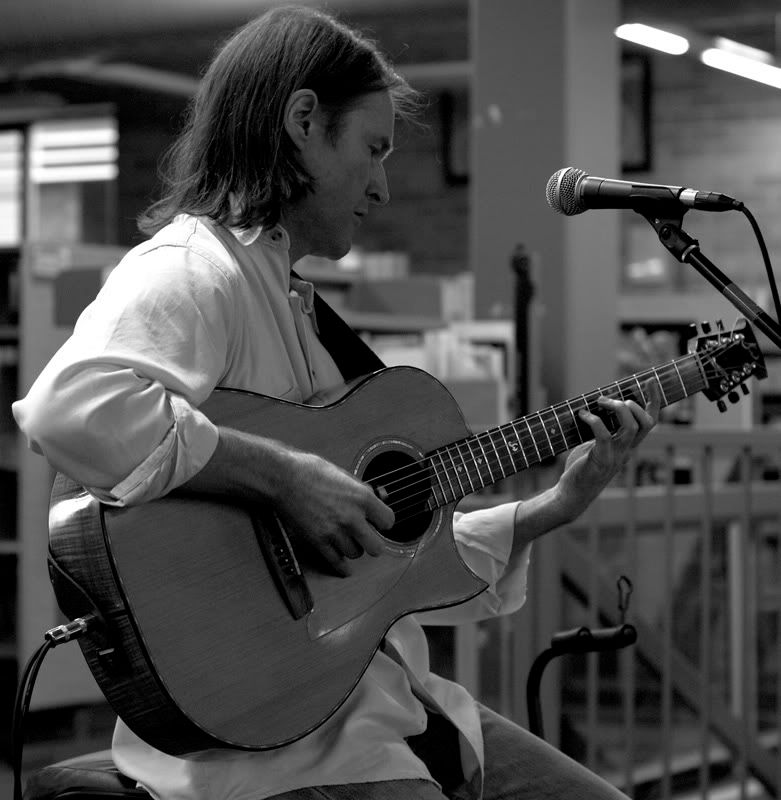
what do you think of the B&W conversion?
My question is, note the fluro lights in the top right corner, one edge of them is razor sharp, even in the full sized version. Given that everything else at this distance is OOF, what would cause this?
Regards,
Owen.
-

owen
- Senior Member
-
- Posts: 1699
- Joined: Thu Jan 06, 2005 3:21 pm
- Location: Nowra, NSW
-
by TonyH on Thu Dec 01, 2005 10:57 pm
Hi Owen,
is the flouro light razor sharp or blown out exposure?
Regards
Tony
All I know, is that I don't know enough.....
-
TonyH
- Senior Member
-
- Posts: 856
- Joined: Wed Aug 17, 2005 7:39 am
- Location: Brisbane, QLD Nikon D200 & D70
by Onyx on Thu Dec 01, 2005 11:53 pm
Just coincidence I think Owen.
I don't think this is the ideal B+W conversion, as the singer's face falls in the shadows and consequently looks a little muddy. I don't know which method you used, but try another one. I could suggest blue channel desaturate, as I've had some success with that - in low light conditions where the blue channel is noisy (this image doesn't look particularly high ISO/low light-ish).
-

Onyx
- Senior Member
-
- Posts: 3631
- Joined: Sat Aug 07, 2004 6:51 pm
- Location: westsyd.nsw.au
-
by owen on Fri Dec 02, 2005 8:18 am
I'll have another go with that Onyx.
The method I used was convert to lab, delete the a + b channels, convert back to rgb and then add a bit of contrast.
I'll try what you suggested and see what happens... I haven't done too many black and whites before

Cheers,
Owen.
-
owen
- Senior Member
-
- Posts: 1699
- Joined: Thu Jan 06, 2005 3:21 pm
- Location: Nowra, NSW
-
by owen on Fri Dec 02, 2005 8:20 am
Tony, the light is blown out, however one edge of it is out of focus and the other long edge is sharp, I don't really know why it would do that.
Regards,
Owen.
-
owen
- Senior Member
-
- Posts: 1699
- Joined: Thu Jan 06, 2005 3:21 pm
- Location: Nowra, NSW
-
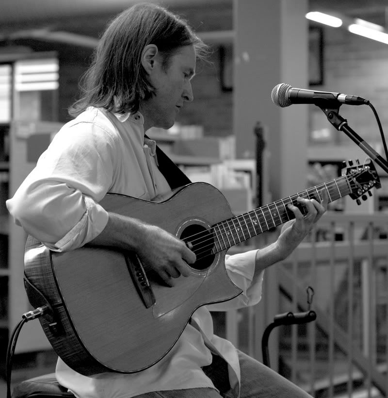
by owen on Fri Dec 02, 2005 8:35 am
Do you think this is any better?
 Last edited by owen on Fri Dec 02, 2005 10:06 am, edited 1 time in total.
-
owen
- Senior Member
-
- Posts: 1699
- Joined: Thu Jan 06, 2005 3:21 pm
- Location: Nowra, NSW
-
by paulvdb1 on Fri Dec 02, 2005 9:14 am
I think you're just the victim of bad lighting in the library 
Nothing much you could've done short of being in a different position - like his left instead of his right Regards, Paul Vandenberg
D7000 (D70S retired) - 18-70mm, 50mm F1.8, 35mm F2, Sigma 70-300mm
-
paulvdb1
- Member
-
- Posts: 128
- Joined: Mon Jun 27, 2005 2:22 pm
- Location: NW Sydney
by Onyx on Fri Dec 02, 2005 1:33 pm
Owen, I just had a lightbulb over my head moment...
The rendering of the sharp fluro light edge could be relatd to the MTF chart characteristics of the lens in use.
OK, picture concentric circles starting from the lens' point of absolute centre. Detail running outwards from the centre corresponds to the sagital lines in the MTF chart of the lens, and details perpendicular to these running around the concentric circles are the meridonial lines.
If the resolving power along the sagital and meridonial axis of the lens used for this image differ greatly, this would lead to the OOF/bokeh elements taking of varying degrees of unsharpness along the two axis as observed. This is my hypothesis for why the light in the background seems to have the long edge 'sharp'.
Here's a primer in modulation transfer functions for what I'm referring to:
http://www.luminous-landscape.com/tutor ... -mtf.shtml
-
Onyx
- Senior Member
-
- Posts: 3631
- Joined: Sat Aug 07, 2004 6:51 pm
- Location: westsyd.nsw.au
-
by owen on Fri Dec 02, 2005 1:42 pm
Hey Onyx, that lightbulb you found sure is confusing! I think you're right though as what you said was very technical.
Actually I just read over that link and understood most of it, but I am not sure how it would relate to having a sharp defined line in an out of focus area.
I'm happy to say that it was an anomally and ignore it.. or better yet I might even clone it out... maybe put a ceiling fan in it's place or something like that lol
Thanks Onyx.
-
owen
- Senior Member
-
- Posts: 1699
- Joined: Thu Jan 06, 2005 3:21 pm
- Location: Nowra, NSW
-
by mudder on Fri Dec 02, 2005 3:51 pm
Prefer the second shot with more detail of the artist, wondering whether it might be worth trying to just raise the "lightness" on the artist only and leaving the background slightly darker? Just a thought for keeping viewer focus on the artist and keeping the busy background from distracting...
Just thinking aloud...
Aka Andrew
-

mudder
- Senior Member
-
- Posts: 3020
- Joined: Fri Oct 29, 2004 5:58 pm
- Location: Melbourne - Burwood East
-
Return to Image Reviews and Critiques
|
