Page 1 of 1

landscape attempt(s)

PostPosted: Wed Aug 29, 2007 11:54 pm
by DavidR
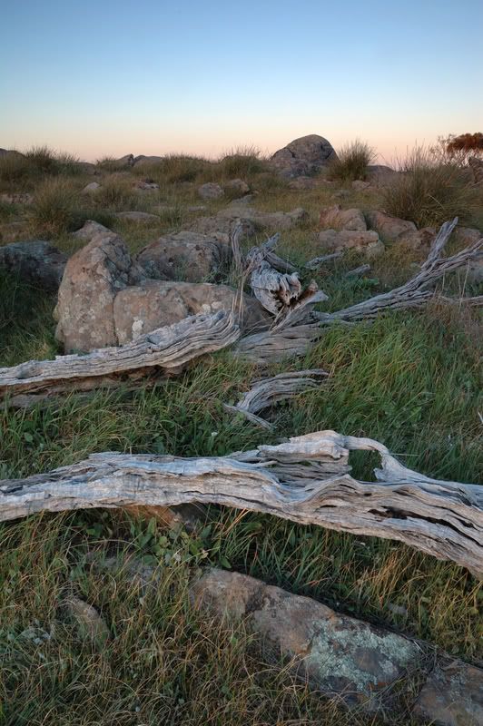
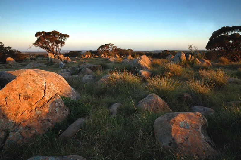
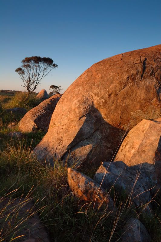
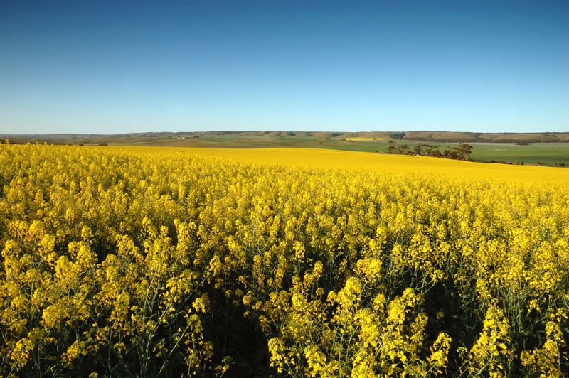
hey everyone, i recently hurt my shoulder and as a consequence ive had some free time to go do some shooting. So seeing the weather was good today i headed to the hills to try some landscape shots. any feedback would be greatly appreciated. Oh and if the canola shot looks familar i reshot the spot today as the weather was a whole lot better for it!

Image

Image

Image

Image

PostPosted: Wed Aug 29, 2007 11:57 pm
by Patrolman Pat
I love 2 and 3. The mix of textures and shapes in the second it excellent and there's a lot of depth to the shot..

PostPosted: Thu Aug 30, 2007 12:31 am
by Pehpsi
I think #4 is the winner here. Lovin' those colours..

PostPosted: Thu Aug 30, 2007 9:47 am
by Mr Darcy
Just to be different, #1 stands out to me. Ij just want to walk into the picture.

#3 is a close second.

PostPosted: Thu Aug 30, 2007 11:35 am
by poompy
love #4 fantastic colours.

PostPosted: Fri Aug 31, 2007 8:37 am
by Gripboy
Nice group of shots here.
Number 3 is my choice. Fantastic colors and framing. Suitable for framing!


I felt the framing of number 2 was off a little, the trees on either side of the frame are both cut off.

Nice textures and interesting composition on number 1.

Number four: nice colors, good solid composition.

good work!

PostPosted: Fri Aug 31, 2007 9:54 am
by marcotrov
Beautiful tone, texture and colours. The beautiful light has served you well.

The golden light falling on the scene in #2 together with the framing has created a very pleasing image.
I think the horizon needs slight adjustment in #3. Th tree in the background seems a little tilted.
Last the canola fields, beautiful colours and scene. Don't know if you used a tripod or wind was a factor but a little sharpness needed in the foreground canola. Perhaps even cropping a little off the bottom to remove some of that negative space that doesn't really enhance the image at all. Hope that makes sense :)
cheers
marco

PostPosted: Mon Sep 03, 2007 4:53 pm
by DavidR
thanks for the reponses everyone. i hadnt notice the horizon was wonky so my Sony!!! i also hear you on the negative space. all taken under advisement!

PostPosted: Tue Sep 04, 2007 10:35 pm
by Matt. K
Nice work! You have an eye for landscapes and know how to play colours against each other. Pix 1,2 and 4 work beautifully for me. Pic 3 is weak in the composition as the curve of the rock in the foreground leads the eye out of the image space. This diminishes the tree in the background which almost appears as a seperate image.