C&C appreciated.
A discussion forum - and more - for users of Digital Single Lens Reflex cameras.
Back to basicsModerators: Greg B, Nnnnsic, Geoff, Glen, gstark, Moderators
Forum rules
Please note that image critiquing is a matter of give and take: if you post images for critique, and you then expect to receive criticism, then it is also reasonable, fair and appropriate that, in return, you post your critique of the images of other members here as a matter of courtesy. So please do offer your critique of the images of others; your opinion is important, and will help everyone here enjoy their visit to far greater extent. Also please note that, unless you state something to the contrary, other members might attempt to repost your image with their own post processing applied. We see this as an acceptable form of critique, but should you prefer that others not modify your work, this is perfectly ok, and you should state this, either within your post, or within your signature. Images posted here should conform with the general forum guidelines. Image sizes should not exceed 950 pixels along the largest side (height or width) and typically no more than four images per post or thread. Please also ensure that you have a meaningful location included in your profile. Please refer to the FAQ for details of what "meaningful" is.
Previous topic • Next topic
5 posts
• Page 1 of 1
Back to basics
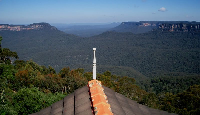
Dusted the cobwebs off my old 3mp Casio Z3 and came up with this.
C&C appreciated. __________
Phillip **Nikon D7000**
I'm in two minds about this one. The view that day was fabulous with visibility for many miles but i feel the rooftop spoils it a bit, then i look at the rooftop and i like it but it looks out of place.
One thing is for sure, the image does weird things in my mind, which is not a bad thing. Steve.
|D700| D2H | F5 | 70-200VR | 85 1.4 | 50 1.4 | 28-70 | 10.5 | 12-24 | SB800 | Website-> http://www.stevekilburn.com Leeds United for promotion in 2014 - Hurrah!!!
I look at this pic and think - Oh! Another landscape! But the roof adds another dimension and the result - I like
Chris
-------------------------------- I started my life with nothing and I’ve still got most of it left
It's actually a restaurant within the Echo motel or guest house or whatever it's called. I didn't stay there, just went in for lunch. Food was just as good as the view.
__________
Phillip **Nikon D7000**
Previous topic • Next topic
5 posts
• Page 1 of 1
|


