
Again in this 2nd one, we had the umbrella too directed towards Katie (only) and not even enough. The contrast between the light on each of their faces is distracting to me. It was fun to play around with the lights (SB800's) though!
A discussion forum - and more - for users of Digital Single Lens Reflex cameras.
Craig and KatieModerators: Greg B, Nnnnsic, Geoff, Glen, gstark, Moderators
Forum rules
Please note that image critiquing is a matter of give and take: if you post images for critique, and you then expect to receive criticism, then it is also reasonable, fair and appropriate that, in return, you post your critique of the images of other members here as a matter of courtesy. So please do offer your critique of the images of others; your opinion is important, and will help everyone here enjoy their visit to far greater extent. Also please note that, unless you state something to the contrary, other members might attempt to repost your image with their own post processing applied. We see this as an acceptable form of critique, but should you prefer that others not modify your work, this is perfectly ok, and you should state this, either within your post, or within your signature. Images posted here should conform with the general forum guidelines. Image sizes should not exceed 950 pixels along the largest side (height or width) and typically no more than four images per post or thread. Please also ensure that you have a meaningful location included in your profile. Please refer to the FAQ for details of what "meaningful" is.
Previous topic • Next topic
7 posts
• Page 1 of 1
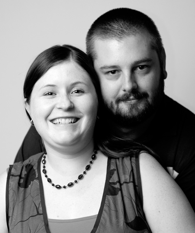
Craig and Katie
Another one that I have played with from an impromptu setup of Paul's stand, umbrella and SB800 holder. If I was to critique this myself I would have decreased the appeture and shot it at around F5, this was F2.8 . Katie's forehead is a little on the hot side but it's a nice shot I think of the two of them. Comments welcomed:
Again in this 2nd one, we had the umbrella too directed towards Katie (only) and not even enough. The contrast between the light on each of their faces is distracting to me. It was fun to play around with the lights (SB800's) though! Last edited by Geoff on Wed Feb 14, 2007 11:05 am, edited 1 time in total.
Geoff
Special Moments Photography Nikon D700, 50mm 1.4, 85mm 1.4, 70-200 2.8VR, SB800 & some simple studio stuff.
I can't really comment on the lighting cause I only work with natural light and a bit of fill flash...but I think the portrait is a nice natural shot of them both and no doubt they will be well pleased with it!
The last thing I want to do is hurt you... but it's still on the list...
Another couple of very good portraits and I like the tonal range in these two much better. It still does not look like the eyes are a point of focus in these portraits and I think one face is sharper than the other. Perhaps you should go at least f8?
Alex
The second one I consider better because the pose is more...homely? Togethernessey? Whatever.
President, A.A.A.A.A (Australian Association Against Acronym Abuse)
Canon EOS R6, RF 24-105 F4, RF 70-200 F4, RF 35mm F1.8, RF 16mm F2.8 "And ye shall know the truth, and the truth shall make you free." (John 8:32)
going well Geoff!
In the 2nd picture, Craig has too much shadow (in comparison to katie) Might need to next time bring his head in closer, - aligned with hers or Ideally throw some more light on him from the right side. Keep up the great work! Jonathan
Previous topic • Next topic
7 posts
• Page 1 of 1
|


