Page 1 of 1

Beach life.

PostPosted: Sat Feb 25, 2006 1:27 pm
by owen
Here's another shot from this morning. I took this because although the foreground is empty I like the lines leading into the image. To me the foreground is calm and it leads you to the crashing waves of the surf.

Comments welcome.

:)

Image

Regards,
Owen.

PostPosted: Sat Feb 25, 2006 1:49 pm
by marcotrov
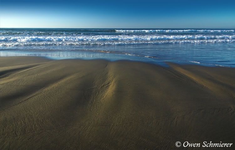
Owen the image is generally well thought through and I can see what you were trying to do but for me the individual elements i.e. the sand gullies, the waves and the sky are just not strong enough to pull it off. The sky also is a little distracting, despite its good proportions relative to rest of scene, because of the unevenness of the toning. Did you use a polariser?
As a suggestion perhaps the use of a neutral density grad may have evened out the sky and prevented blowout in the left side.
A standout wave or single obvious break with say a set of footprints walking the ridge between the 2 left side gullies disappearing into the water may have produced a stronger compositional image. I think to achieve the sense of tranquility you were after perhaps a little closer to dusk with a little more colour in the sky may have also helped but I can see where you were going with it. Certainly worthy of another crack at it.
Hope this is useful? :)
cheers
marco

PostPosted: Sat Feb 25, 2006 1:56 pm
by owen
Absolutely marco, thanks for the advice. I'm a bit of a cheapskate so I don't have a ND filter... but I did use a polariser. The sky was uneven but I tried to lessen that by adding a colour gradient. Thanks for the helpful advice.

Cheers,
Owen.

PostPosted: Sat Feb 25, 2006 2:49 pm
by mudder
G'day mate,

I like it :)

The sand shows good texture and nice side light, looks a little cool in WB maybe? Great foreground, it's all it needs as it has great interest in the textures and shapes, missing something in either middle or background but I just can't put my finger on it... Some form of subject, or primary focus... Dunno, just rambling...

The gradient works well, did you use "overlay" blending on the gradient?

PostPosted: Sat Feb 25, 2006 3:04 pm
by Mitchell
I really like the shot. The foreground texture really caught and held my attention, although I agree it might be a little cool on the white balance. The background does feel like it is lacking something, but I think that is only relative to the great texture in the foreground.

PostPosted: Sat Feb 25, 2006 3:24 pm
by mudder
Hey mate,

I just had a thought (strewth it always hurts the first time) why not just try a fairly strong, very softly feathered vignette? That might be all it needs to keep the viewers eye in the frame...

PostPosted: Sat Feb 25, 2006 6:50 pm
by owen
Thanks very much on the comments guys. I actually desaturated it a bit because after adjusting the curve of the image it didn't look right, maybe I lost some of the warmth by doing that. I'll look at warming it up a bit and also adding a vignette once I get a bit more time (When my wife stops playing the sims! :) )