Page 1 of 1
Marysville Waterfalls pt.II (6 images)

Posted:
Fri Feb 03, 2006 11:12 amby NikonUser
Posted:
Fri Feb 03, 2006 11:17 amby Alpha_7
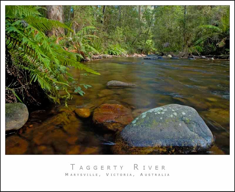
My favourite would be Taggerty River, but this is a nice collection of shots.
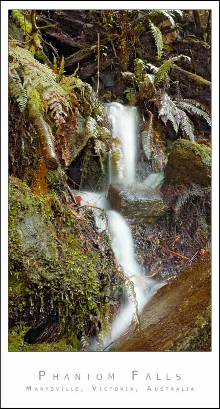
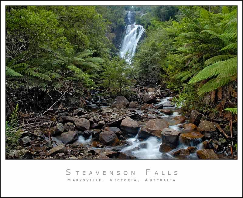
Some of them look like you've had a challenge to expose the shot nicely.. like that first shot seems very hot!
Posted:
Fri Feb 03, 2006 11:21 amby NikonUser
It was definately a challenge to get the exposure right.
Even with the water a little overexposed the background was still severely underexposed... D-lighting and Shadow/Highlight are working hard on these images.
Paul
Posted:
Fri Feb 03, 2006 12:06 pmby LIVE4EVA
Hey Paul
Great shots.
Just wondering i have tried a couple of times with waterfalls and i always seem to have the problem or getting a long enough exposure...
so the question being do you use a ND filter or something similar?
Thanks
LIVE4EVA
Posted:
Fri Feb 03, 2006 12:09 pmby wendellt
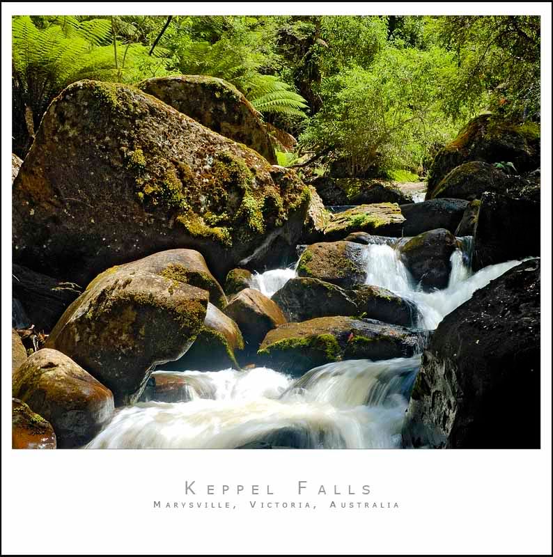
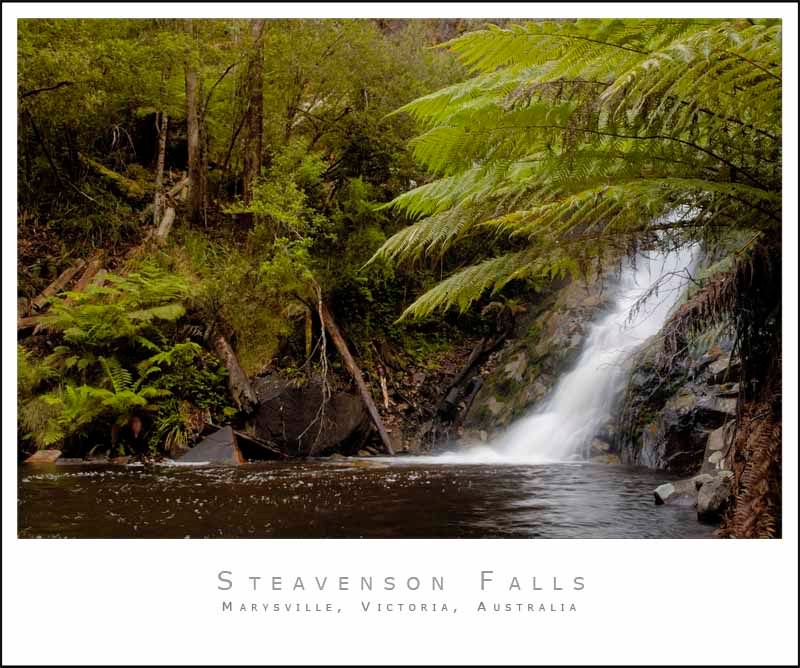
that 2nd one paul just ZZiings!!!, amazing composition too it looks very compact and intimate, you must be very happy with that
Posted:
Fri Feb 03, 2006 12:16 pmby NikonUser
Thanks for the comments guys.
Live4eva.... I don't have a ND filter yet (wish I did) but I did use a circular polarising filter which cuts down the light by a bit. Also there was a little bit of cloud cover so I waited until the sun went behind the clouds before taking the shots.
These falls were also under a fair bit of canopy which helped cut down on the light levels.
I do like the second one quite a bit. I wasn't a fan until I cropped it to be square.
Paul
Posted:
Fri Feb 03, 2006 12:44 pmby stubbsy
Paul
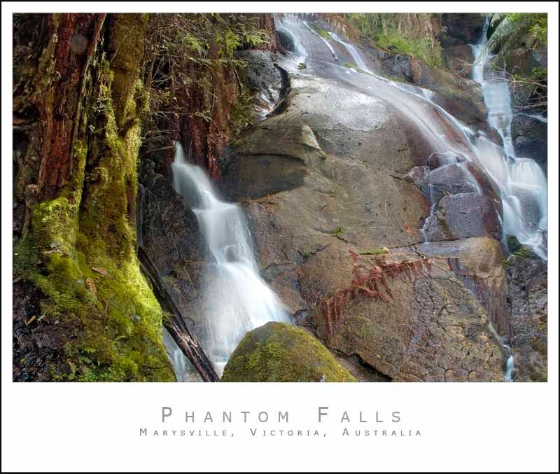
#2 and #3 do it for me, but they all seem a little too warm on both my monitors - maybe add a little green and remove some red from the colour balance.
Posted:
Fri Feb 03, 2006 12:47 pmby NikonUser
I will give that a go stubbsy.
I hate doing the whole white balance thing. I don't know if it's my colourblindness or what but I can never get anything that I'm satisfied with in any of my pics.
My girlfriend and I both can't see any redness or warmness in the images (uncalibrated monitor here) so maybe our screens are different?
Will give them a play
Paul
Posted:
Fri Feb 03, 2006 1:01 pmby LIVE4EVA
Thanks Paul
Umm yeah the second is my fav.
The reason i though ND was it does look like it would be quite bright.
LIVE4EVA
Posted:
Fri Feb 03, 2006 1:32 pmby avkomp
the second one in this series to me has the most potential, this includes the first series also.
the whites are quite hot though.
Regards Steve
Posted:
Fri Feb 03, 2006 1:37 pmby stubbsy
NikonUser wrote:I will give that a go stubbsy.
I hate doing the whole white balance thing. I don't know if it's my colourblindness or what but I can never get anything that I'm satisfied with in any of my pics.
My girlfriend and I both can't see any redness or warmness in the images (uncalibrated monitor here) so maybe our screens are different?l
Paul mine are calibrated but we all perceive things differently. If you look at my pics you'll see I have a tendency towards blues so I obviously have a perceptual bias. Are you red/green colour blind? If so then PP on pics like these must be a challenge - I'm impressed.
Here are 2 quick attempts by me (reworked version on the right in both cases):
In
PSCS2 - Adjust Hue/Saturation (+10, +3)

In
PSCS2 - Used remove Colour Cast Nik Color Efex filter for this one

Posted:
Fri Feb 03, 2006 1:42 pmby NikonUser
Yep I red/green colourblind. Can't do any of those little dot test thingys

Your two reworked versions definately look better.
I can't see much of a change at all in the first shot... but the second is quite dramatic.
I did have a play with the hue in
PSCS2.... but don't understand how it works. Will have to have a read.
Thanks for that.
Paul
Posted:
Fri Feb 03, 2006 3:37 pmby Finch
Paul,
I'm in with most others - no.2 is by far the nicest image, in my view. Your reworked versions are much better and the greens are closer to the real rainforest colours (I have lived, worked and photographed in the rainforest for many years). My monitor is also callibrated with the Spyder Pro 2 and the colours in the reworked version are perfect.
Cheers
Michael
Posted:
Fri Feb 03, 2006 6:30 pmby mudder
G'day mate,
Glad to see you've posted more from the area...
I'd have to go for #4 (Taggerty river) as my favorite, just seems to have a nice simple, non-busy foreground and a serene, calm feel to the image...
I'd be tempted to do some burnin' and dodgin' in some shadows to bring out a dappled light and shadowy type of light...
If you want to reduce the effect of "hot" highlights, you could expose another version of the image and just overlay the lower exposure image straight over the top and rub out all but the water highlights... Works a treat on waterfalls and helps bring out shadow detail by using the high exposure shot for shadows and the low exposure shot for highlights...
I'm a sucker for a nice waterfall shot, I enjoyed these... It's a magic spot...
Posted:
Fri Feb 03, 2006 6:34 pmby NikonUser
Thanks for the tips mudder.
I am going to try and get a little 'artistic' with some post processing in a week or two when we get back from our great ocean road trip.
We might also go back up there with the tips gained from my posts and try again
Thanks
Paul