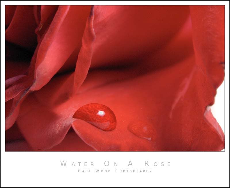
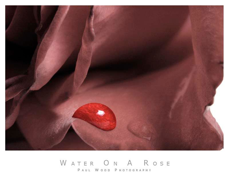
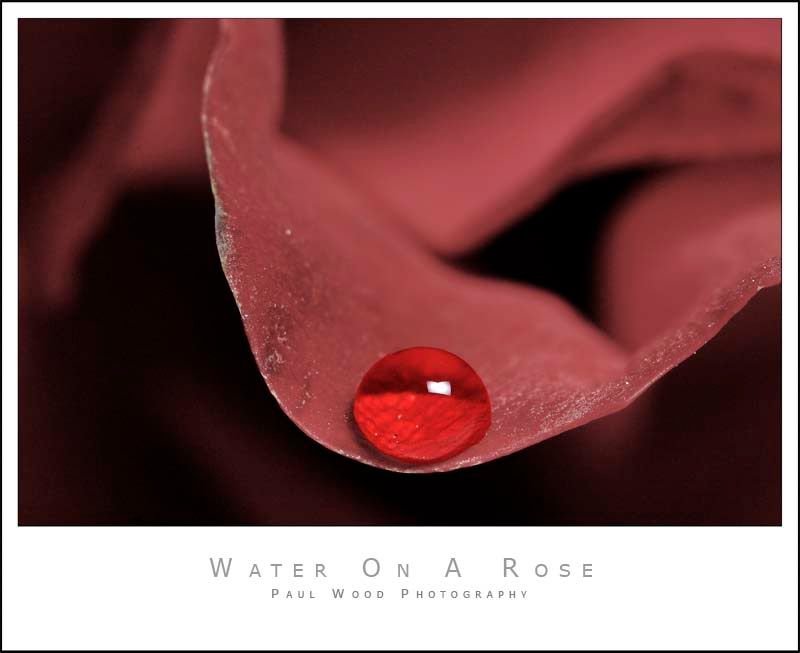
Waterdrops On A Rose
Hi there,
I thought I would try something different today. I'm not sure if I like the results or not.
Any comments?
Paul
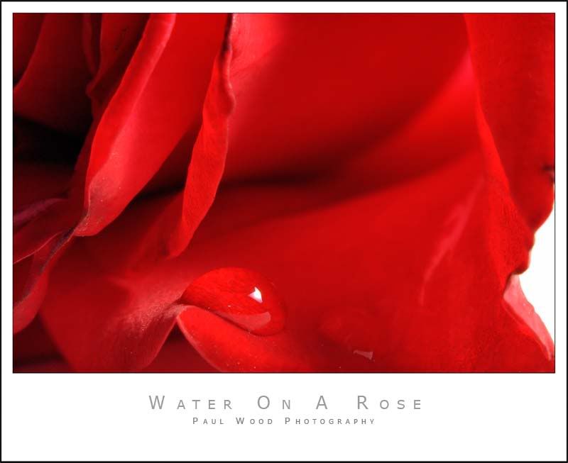
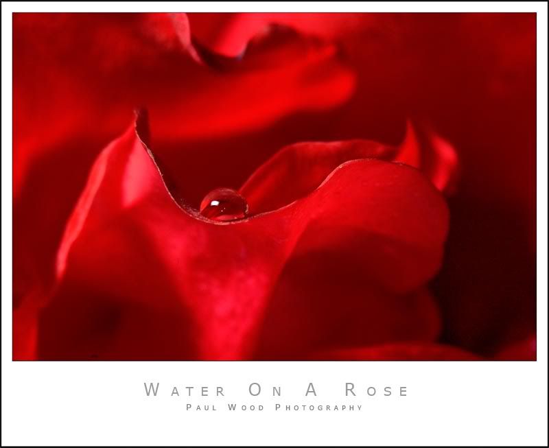
EDIT:
After discussion below I've also come up with these two variations... I'll post them here as well as below so you don't have to scroll all the way down if you don't want to
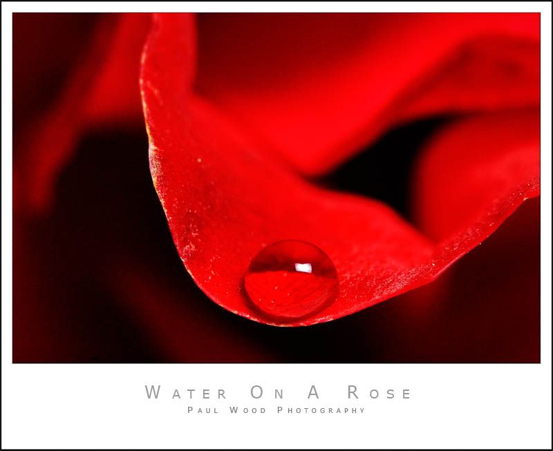
I thought I would try something different today. I'm not sure if I like the results or not.
Any comments?
Paul
EDIT:
After discussion below I've also come up with these two variations... I'll post them here as well as below so you don't have to scroll all the way down if you don't want to