Page 1 of 1
Lights on or lights off?

Posted:
Thu Oct 13, 2005 9:11 pmby phillipb
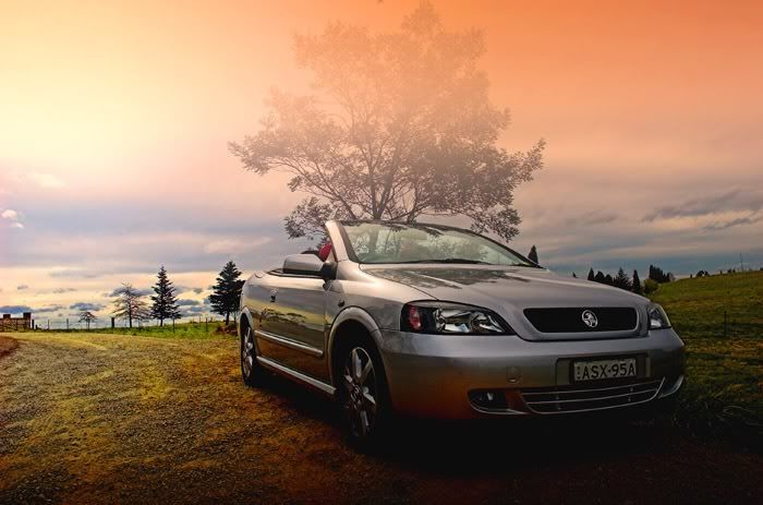
Simple question, which of these two photos is better, the first with the lights off or the second?

Posted:
Thu Oct 13, 2005 9:19 pmby leek
#2 looks better to me... Are those really the lights? or is it PP... I noticed that the clowds hadn't moved between the 2 shots...

Posted:
Thu Oct 13, 2005 9:20 pmby wendellt
lights off
less distracting and it makes sense it isn't exactly dark.
is this a composite image? it looks very stylish very well done.
Posted:
Thu Oct 13, 2005 9:21 pmby sheepie
on - great pic!
Posted:
Thu Oct 13, 2005 9:26 pmby phillipb
Sorry to lead you astray guys, I really wanted to see if the PP on the lights was very obviously fake. I should have known that you would have picked up on the fact that it's the same photo.
I was happy the way the first turned out, but everytime I looked at it I couldn't help feeling that I should have turned the headlights on. So I tried it with PP.
Posted:
Thu Oct 13, 2005 9:38 pmby NikonUser
On I think:
In the first image my eyes are first drawn to the sky and then down to the car
In the second my eyes go to the lights and the car first.
Both pics look very nice though!!
Paul
Posted:
Thu Oct 13, 2005 9:40 pmby Matt. K
Off...or on. Maybe the little lights down near the bumper might be better on?
Posted:
Thu Oct 13, 2005 9:41 pmby TonyH
I believe the lights on reflects more the overall lightness of the shot......
Posted:
Thu Oct 13, 2005 10:11 pmby nito
lights on adds cats eyes to the car. Much better for the mood of the shot.
Nice car
btw.

Posted:
Thu Oct 13, 2005 10:21 pmby phillipb
Thanks for the replies guys. I'm thinking that it may be worthwhile driving down to the southern highlands again to try and replicate the shot with the real lights on.
Posted:
Thu Oct 13, 2005 11:10 pmby PiroStitch
I prefer off and the gradiated orange doesn't help the tree
Maybe try multiply or overlay for the gradient layer.
The yellow headlights look too much like transformers for me...err cartoon not electrical

Posted:
Thu Oct 13, 2005 11:35 pmby kipper
Phillip.....this shot could be so much better
Seriously I think it has the elements to be a good shot.
1) As already mentioned the graduated sky shouldn't affect the tree so you'll need to do a bit more PP around that
2) Make sure all lights that come on with the light switch are on
3) Make sure all necessarily reflections on the car exhibit the lights being on
4) Can you retake the image as I'd like to see the tall tree to the left of the car not cutting through the car
Edit:
5) Can you retake it with a better angle of the road so it shows you where the car is coming from
Posted:
Fri Oct 14, 2005 12:04 amby MCWB
PiroStitch wrote:The yellow headlights look too much like transformers for me...err cartoon not electrical
Optimus Prime represent!

In the context of this comparison the lights do look a bit fake, but if you'd shown just the "lights on" pic by itself I'm not sure I'd have picked it. Regardless, the sky just looks bizarre for mine, do you have one with unadulterated sky?
Posted:
Fri Oct 14, 2005 12:16 amby phillipb
Here is the original, complete with humangus dust bunny.

Posted:
Fri Oct 14, 2005 12:43 amby MCWB
Have to say, I actually quite like the sky in the original Phillip!
Maybe just some more saturation in the blue colour and the sky's a winner IMO (apart from the DB of course).
Posted:
Fri Oct 14, 2005 12:54 amby Catcha
First one would be my pick, nice shot
BTW
Posted:
Fri Oct 14, 2005 5:14 amby flipfrog
nice image!
i think it looks like its str8 from a magazine
my only complaint is the underexposed area in the front of the car, the orig is not as bad tho.....
Posted:
Fri Oct 14, 2005 7:53 amby the foto fanatic
I prefer lights on, but I agree with kipper. The shot would be beter without the tree growing out of the car.
Posted:
Fri Oct 14, 2005 9:10 amby cordy
I think lights on too, it draws more attention to the car
Chris
Posted:
Fri Oct 14, 2005 11:57 amby shutterbug
Lights off for me. Love the background colour and trees.
Its more fun in the dark

Posted:
Fri Oct 14, 2005 1:18 pmby nat
my 2 cents worth......lights on.
I picked the fake lights straight away, but think they make a statement. (I did find the sky a bit distracting 'though.)
I have to say that it is quite interesting to read other peoples take on this one. Thanks.